REBRANDING. HALCYON.
REBRANDING. HALCYON.
The task in this project was to rebrand a “Dollar Store” like brand. the project ran through different phases such as brand discovery, competition analysis, SWOT analysis, and brand identity crafting, among others to finally have a compelling and eye-catching brand.
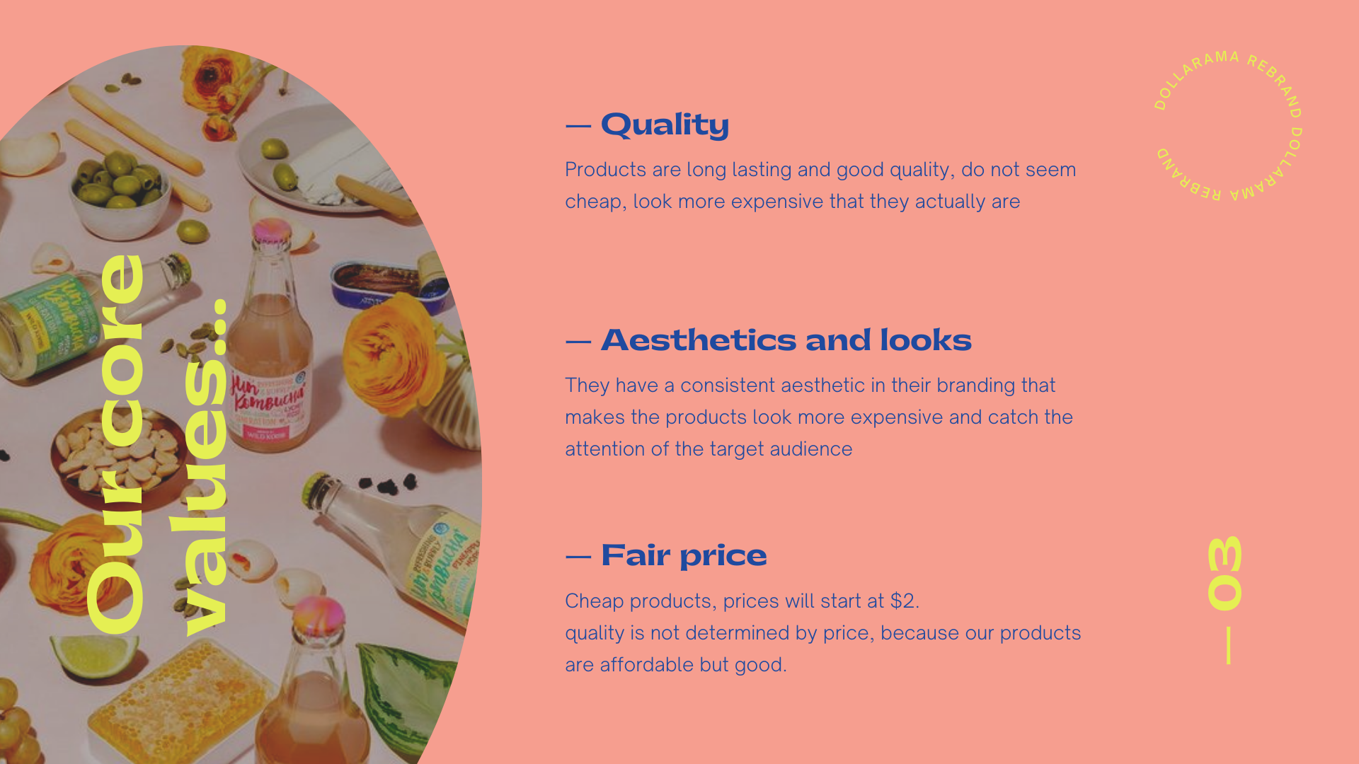
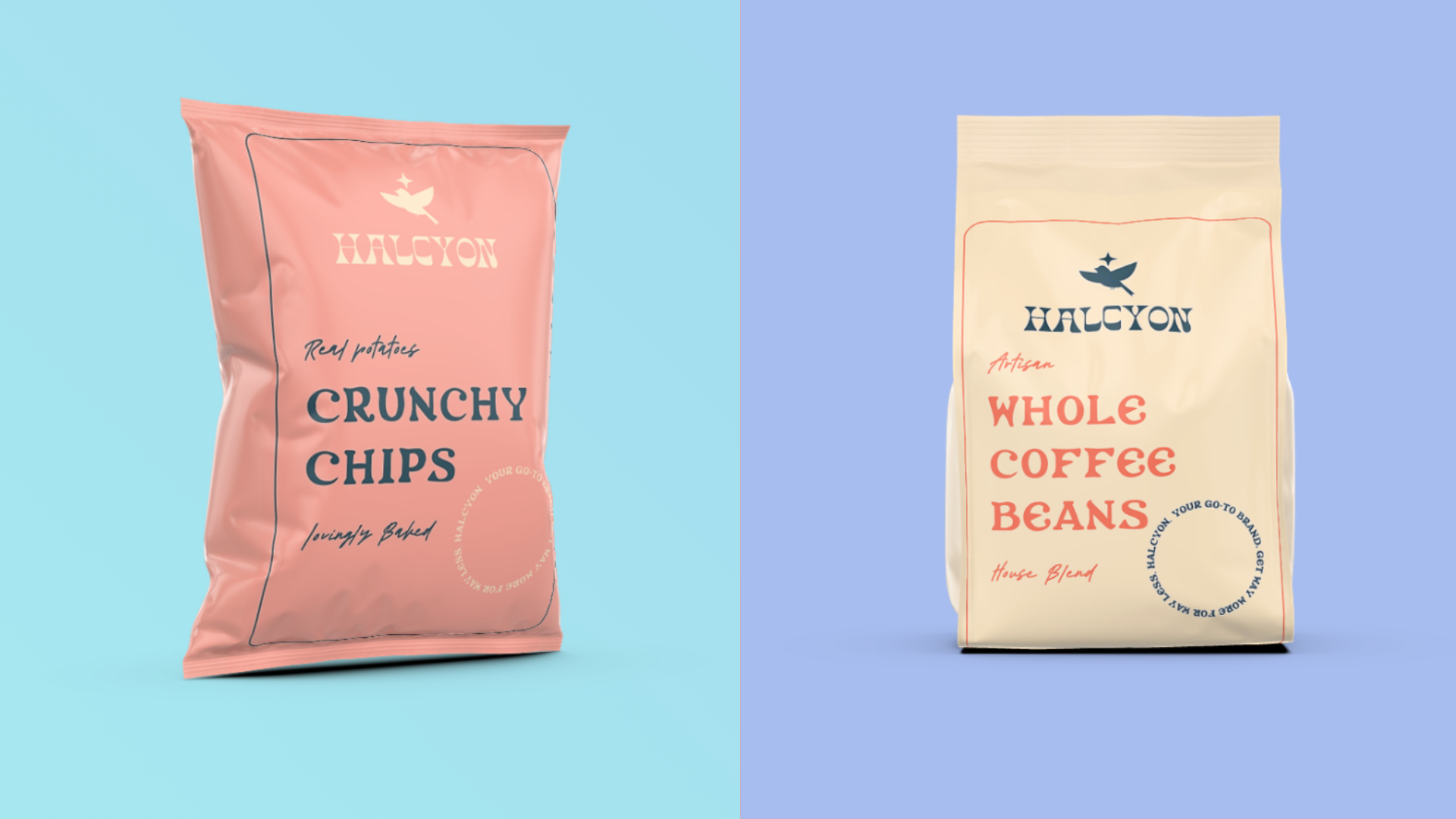
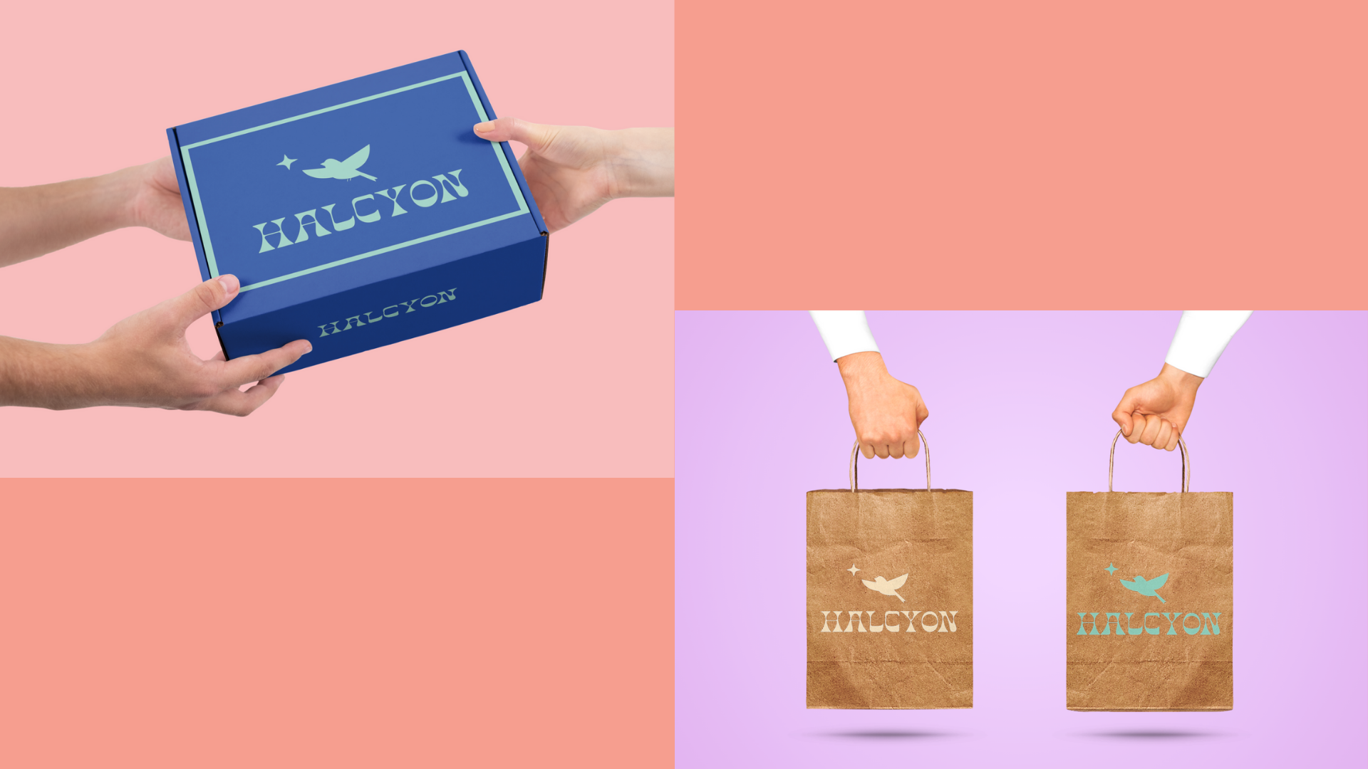
One of the main purposes of this project was to find a way to make the brand image more appealing, portray the brand through a different lens, and lose the whole “Dollar Store” feel.
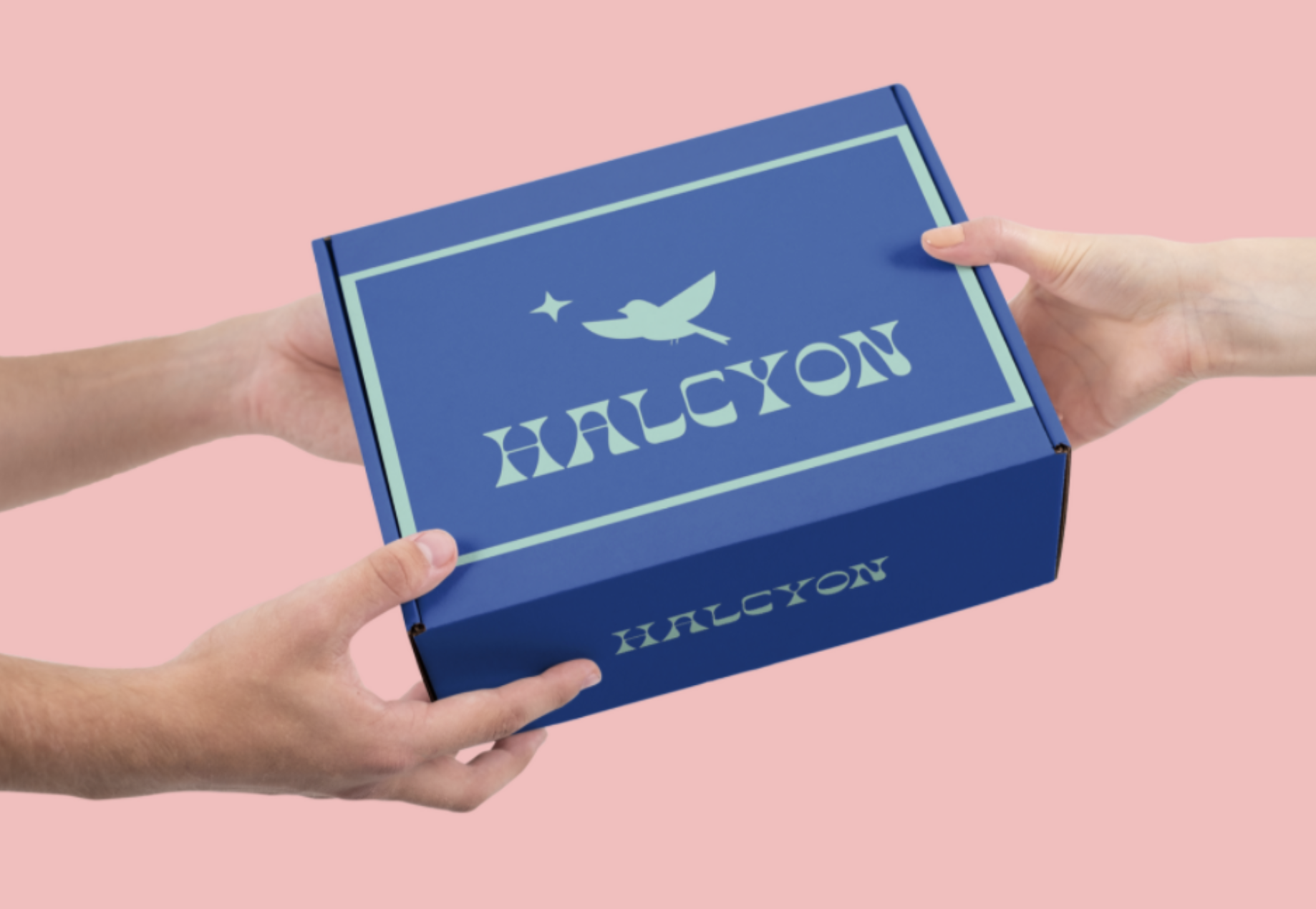
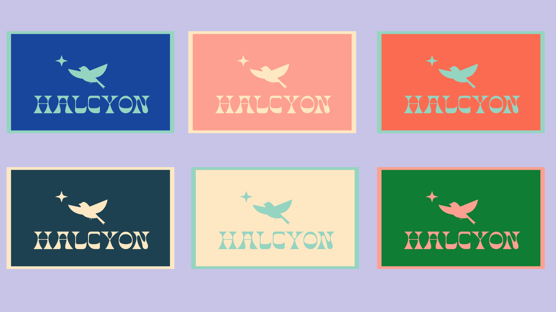
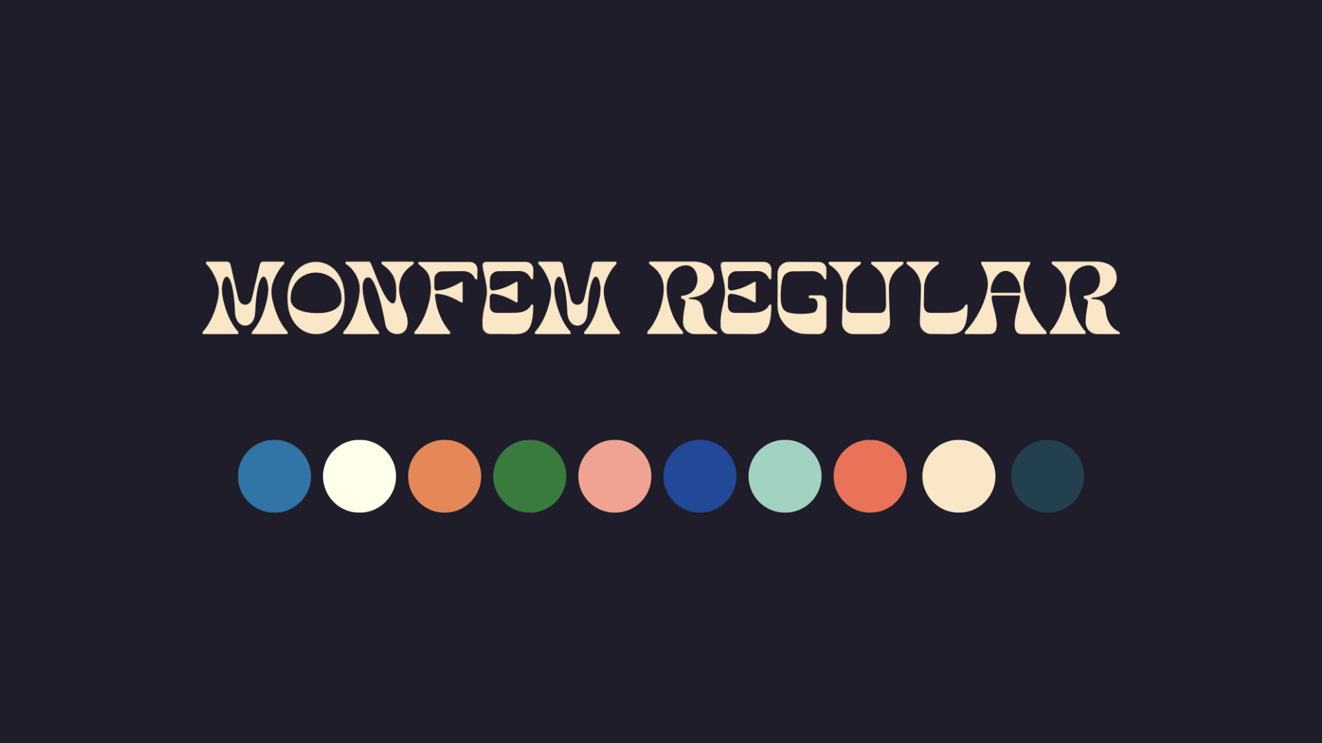
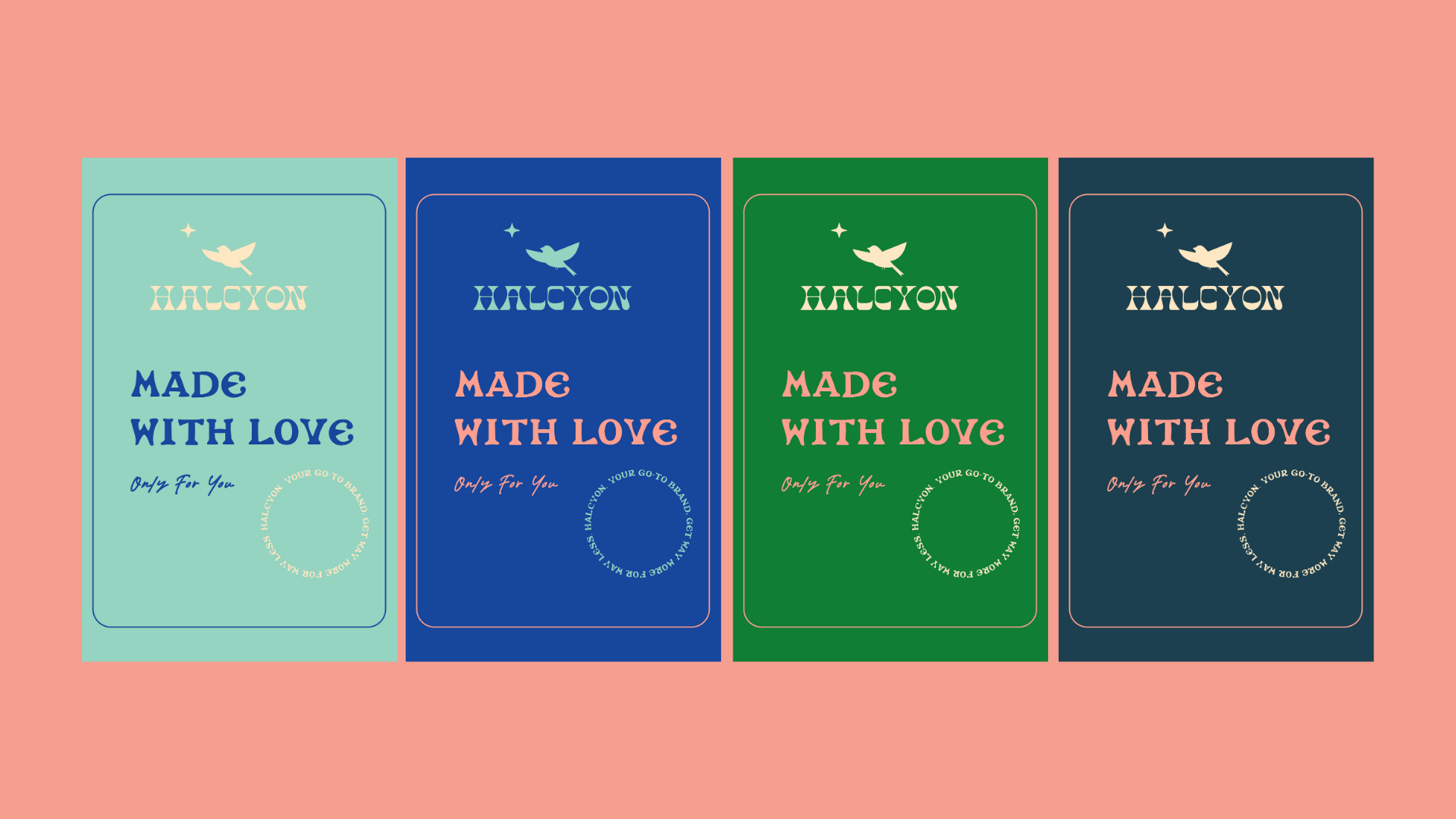
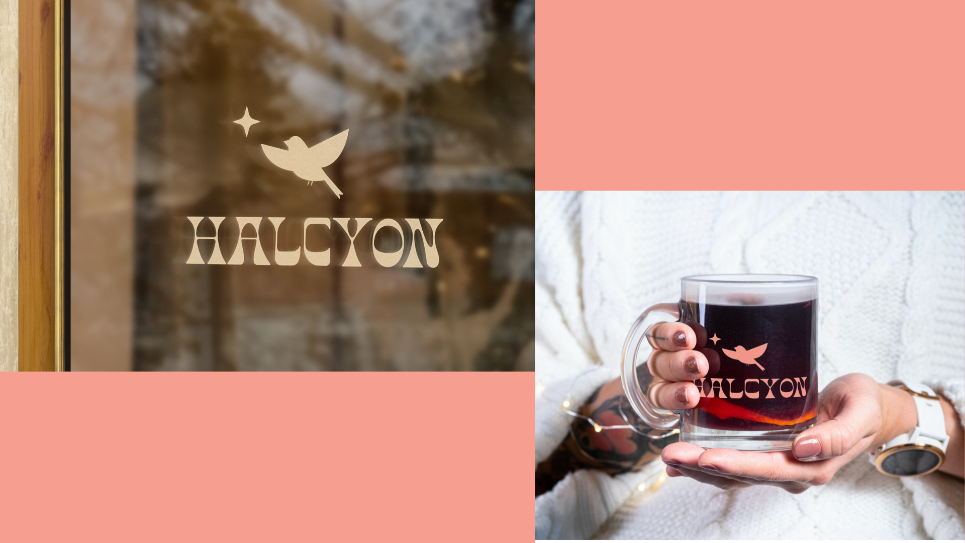
I drew inspiration from the 70s, retro aesthetics and other stores that have clean and eye-catching branding who at the same time low price points. This helped me establish the color palette and font I wanted to use for the brand image. I came up with the slogan “Get way more, for way less” and a new name of the brand “Halcyon”. Halcyon means happiness, which is how I wanted the brand to feel like.
From there, with the name in mind, I came up with the logo, I went through a discovery phase of trial and error and finally landed on the final version and a variation. I then created mockups to exemplify how the brand would look like in action and real life with different types of products and print elements.